 我的书签
我的书签
 添加书签
添加书签 移除书签
移除书签- Card 卡片
- 基础用法
- 简单卡片
- 带图片
- 卡片阴影
- Attributes
Card 卡片
将信息聚合在卡片容器中展示。
基础用法
包含标题,内容和操作。
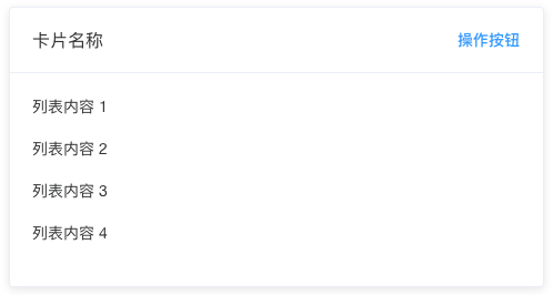
Card 组件包括header和body部分,header部分需要有显式具名 slot 分发,同时也是可选的。
<el-card class="box-card"> <div slot="header" class="clearfix"> <span>卡片名称</span> <el-button style="float: right; padding: 3px 0" type="text">操作按钮</el-button> </div> <div v-for="o in 4" :key="o" class="text item"> {{'列表内容 ' + o }} </div></el-card><style> .text { font-size: 14px; } .item { margin-bottom: 18px; } .clearfix:before, .clearfix:after { display: table; content: ""; } .clearfix:after { clear: both } .box-card { width: 480px; }</style>
简单卡片
卡片可以只有内容区域。
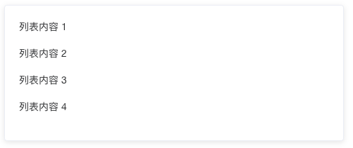
<el-card class="box-card"> <div v-for="o in 4" :key="o" class="text item"> {{'列表内容 ' + o }} </div></el-card><style> .text { font-size: 14px; } .item { padding: 18px 0; } .box-card { width: 480px; }</style>
带图片
可配置定义更丰富的内容展示。
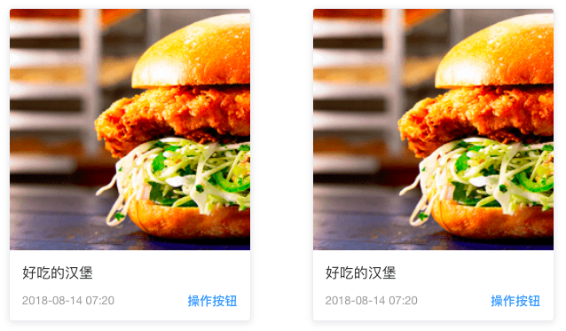
配置body-style属性来自定义body部分的style,我们还使用了布局组件。
<el-row> <el-col :span="8" v-for="(o, index) in 2" :key="o" :offset="index > 0 ? 2 : 0"> <el-card :body-style="{ padding: '0px' }"> <img src="~examples/assets/images/hamburger.png" class="image"> <div style="padding: 14px;"> <span>好吃的汉堡</span> <div class="bottom clearfix"> <time class="time">{{ currentDate }}</time> <el-button type="text" class="button">操作按钮</el-button> </div> </div> </el-card> </el-col></el-row><style> .time { font-size: 13px; color: #999; } .bottom { margin-top: 13px; line-height: 12px; } .button { padding: 0; float: right; } .image { width: 100%; display: block; } .clearfix:before, .clearfix:after { display: table; content: ""; } .clearfix:after { clear: both }</style><script>export default { data() { return { currentDate: new Date() }; }}</script>
卡片阴影
可对阴影的显示进行配置。
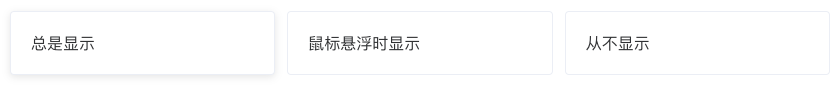
通过shadow属性设置卡片阴影出现的时机:always、hover或never。
<el-row :gutter="12"> <el-col :span="8"> <el-card shadow="always"> 总是显示 </el-card> </el-col> <el-col :span="8"> <el-card shadow="hover"> 鼠标悬浮时显示 </el-card> </el-col> <el-col :span="8"> <el-card shadow="never"> 从不显示 </el-card> </el-col></el-row>
Attributes
| 参数 | 说明 | 类型 | 可选值 | 默认值 |
|---|---|---|---|---|
| header | 设置 header,也可以通过 slot#header 传入 DOM |
string | — | — |
| body-style | 设置 body 的样式 | object | — | { padding: '20px' } |
| shadow | 设置阴影显示时机 | string | always / hover / never | always |
原文: http://element-cn.eleme.io/#/zh-CN/component/card
