 我的书签
我的书签
 添加书签
添加书签 移除书签
移除书签- 引入
- 使用指南
- 代码演示
- 基本
- 按钮禁用
- 多按钮
- 使用插槽
- API
- ActionBar Props
- ActionBar Slots
- default
- ActionBar Events
- @click(event, action)
- @click(event, action)
ActionBar 操作栏

汇集若干文案或操作按钮的吸底边栏,可用于展示表单信息与提交按钮
引入
import { ActionBar } from 'mand-mobile'Vue.component(ActionBar.name, ActionBar)
使用指南
默认使用position: fixed固定在页面底部,为避免遮挡内容区底部预留不小于100px的空白(iPhone还需额外增加constant(safe-area-inset-bottom))
代码演示
基本
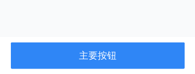
<template><div class="md-example-child md-example-child-action-bar md-example-child-0"><md-action-bar :actions="data"></md-action-bar></div></template><script>import {ActionBar, Toast} from 'mand-mobile'export default {name: 'action-bar-demo',components: {[ActionBar.name]: ActionBar,},data() {return {data: [{text: '主要按钮',onClick: this.handleClick,},],}},methods: {handleClick() {Toast.succeed('Click')},},}</script>
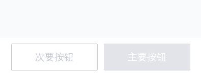
按钮禁用
        <template>
  <div class="md-example-child md-example-child-action-bar md-example-child-1">
    <md-action-bar :actions="data"></md-action-bar>
  </div>
</template>

<script>
import {ActionBar, Toast} from 'mand-mobile'

export default {
  name: 'action-bar-demo',
  components: {
    [ActionBar.name]: ActionBar,
  },
  data() {
    return {
      data: [
        {
          text: '次要按钮',
          disabled: true,
        },
        {
          text: '主要按钮',
          disabled: true,
        },
      ],
    }
  },
  methods: {
    handleClick() {
      Toast.succeed('Click')
    },
  },
}

</script>
多按钮

        <template>
  <div class="md-example-child md-example-child-action-bar md-example-child-0">
    <md-action-bar :actions="data"></md-action-bar>
  </div>
</template>

<script>
import {ActionBar, Toast} from 'mand-mobile'

export default {
  name: 'action-bar-demo',
  components: {
    [ActionBar.name]: ActionBar,
  },
  data() {
    return {
      data: [
        {
          text: '次要按钮',
          onClick: this.handleClick,
        },
        {
          text: '主要按钮',
          onClick: this.handleClick,
        },
      ],
    }
  },
  methods: {
    handleClick() {
      Toast.succeed('Click')
    },
  },
}

</script>
使用插槽

<template>
<div class="md-example-child md-example-child-action-bar md-example-child-3">
<md-action-bar :actions="data" @click="onBtnClick">
<span class="price">
¥128.00<small>起</small>
</span>
</md-action-bar>
</div>
</template>
<script>
import {ActionBar, Dialog} from 'mand-mobile'
export default {
name: 'action-bar-demo',
components: {
[ActionBar.name]: ActionBar,
},
data() {
return {
data: [
{
text: '主要按钮',
},
],
}
},
methods: {
onBtnClick(event, action) {
Dialog.alert({
content: `${action.text}点击`,
})
},
},
}
</script>
<style lang="stylus" scoped>
.price
font-weight 500
font-size 48px
color #FF823A
small
margin-left 10px
font-size 32px
color #858B9C
</style>
API
ActionBar Props
| 属性 | 说明 | 类型 | 默认值 | 备注 |
|---|---|---|---|---|
| actions | 按钮组 | Array<{text, disabled, onClick}> | - | text为按钮文案,disabled为是否禁用该按钮,onClick为点击事件响应函数,传参数与click事件相同 |
ActionBar Slots
default
左侧文案内容
ActionBar Events
@click(event, action)
按钮点击事件
| 属性 | 说明 | 类型 |
|---|---|---|
| action | actions列表中与被点击按钮对应的对象 | Object: {text, disabled, …} |
