 我的书签
我的书签
 添加书签
添加书签 移除书签
移除书签- Flutter 布局(八)- Stack、IndexedStack、GridView详解
- 1. Stack
- 1.1 简介
- 1.2 布局行为
- 1.3 继承关系
- 1.4 示例代码
- 1.5 源码解析
- 1.5.1 属性解析
- 1.5.2 源码
- 1.6 使用场景
- 2. IndexedStack
- 2.1 简介
- 2.2 例子
- 2.3 源码解析
- 2.4 使用场景
- 3. GridView
- 3.1 简介
- 3.2 布局行为
- 3.3 继承关系
- 3.4 示例代码
- 3.5 源码解析
- 3.5.1 属性解析
- 3.5.2 源码
- 3.6 使用场景
- 4. 后话
- 5. 参考
- 1. Stack
Flutter 布局(八)- Stack、IndexedStack、GridView详解
本文主要介绍Flutter布局中的Stack、IndexedStack、GridView控件,详细介绍了其布局行为以及使用场景,并对源码进行了分析。
1. Stack
A widget that positions its children relative to the edges of its box.
1.1 简介
Stack可以类比web中的absolute,绝对布局。绝对布局一般在移动端开发中用的较少,但是在某些场景下,还是有其作用。当然,能用Stack绝对布局完成的,用其他控件组合也都能实现。
1.2 布局行为
Stack的布局行为,根据child是positioned还是non-positioned来区分。
- 对于positioned的子节点,它们的位置会根据所设置的top、bottom、right以及left属性来确定,这几个值都是相对于Stack的左上角;
- 对于non-positioned的子节点,它们会根据Stack的aligment来设置位置。
对于绘制child的顺序,则是第一个child被绘制在最底端,后面的依次在前一个child的上面,类似于web中的z-index。如果想调整显示的顺序,则可以通过摆放child的顺序来进行。
1.3 继承关系
Object > Diagnosticable > DiagnosticableTree > Widget > RenderObjectWidget > MultiChildRenderObjectWidget > Stack
1.4 示例代码
Stack(alignment: const Alignment(0.6, 0.6),children: [CircleAvatar(backgroundImage: AssetImage('images/pic.jpg'),radius: 100.0,),Container(decoration: BoxDecoration(color: Colors.black45,),child: Text('Mia B',style: TextStyle(fontSize: 20.0,fontWeight: FontWeight.bold,color: Colors.white,),),),],);
示例代码我就直接用的Building Layouts in Flutter中的例子,效果如下

1.5 源码解析
构造函数如下:
Stack({Key key,this.alignment = AlignmentDirectional.topStart,this.textDirection,this.fit = StackFit.loose,this.overflow = Overflow.clip,List<Widget> children = const <Widget>[],})
1.5.1 属性解析
alignment:对齐方式,默认是左上角(topStart)。
textDirection:文本的方向,绝大部分不需要处理。
fit:定义如何设置non-positioned节点尺寸,默认为loose。
其中StackFit有如下几种:
- loose:子节点宽松的取值,可以从min到max的尺寸;
- expand:子节点尽可能的占用空间,取max尺寸;
- passthrough:不改变子节点的约束条件。
overflow:超过的部分是否裁剪掉(clipped)。
1.5.2 源码
Stack的布局代码有些长,在此分段进行讲解。
- 如果不包含子节点,则尺寸尽可能大。
if (childCount == 0) {size = constraints.biggest;return;}
- 2.根据fit属性,设置non-positioned子节点约束条件。
switch (fit) {case StackFit.loose:nonPositionedConstraints = constraints.loosen();break;case StackFit.expand:nonPositionedConstraints = new BoxConstraints.tight(constraints.biggest);break;case StackFit.passthrough:nonPositionedConstraints = constraints;break;}
- 3.对non-positioned子节点进行布局。
RenderBox child = firstChild;while (child != null) {final StackParentData childParentData = child.parentData;if (!childParentData.isPositioned) {hasNonPositionedChildren = true;child.layout(nonPositionedConstraints, parentUsesSize: true);final Size childSize = child.size;width = math.max(width, childSize.width);height = math.max(height, childSize.height);}child = childParentData.nextSibling;}
- 4.根据是否包含positioned子节点,对stack进行尺寸调整。
if (hasNonPositionedChildren) {size = new Size(width, height);} else {size = constraints.biggest;}
- 5.最后对子节点位置的调整,这个调整过程中,则根据alignment、positioned节点的绝对位置等信息,对子节点进行布局。
第一步是根据positioned的绝对位置,计算出约束条件后进行布局。
if (childParentData.left != null && childParentData.right != null)childConstraints = childConstraints.tighten(width: size.width - childParentData.right - childParentData.left);else if (childParentData.width != null)childConstraints = childConstraints.tighten(width: childParentData.width);if (childParentData.top != null && childParentData.bottom != null)childConstraints = childConstraints.tighten(height: size.height - childParentData.bottom - childParentData.top);else if (childParentData.height != null)childConstraints = childConstraints.tighten(height: childParentData.height);child.layout(childConstraints, parentUsesSize: true);
第二步则是位置的调整,其中坐标的计算如下:
double x;if (childParentData.left != null) {x = childParentData.left;} else if (childParentData.right != null) {x = size.width - childParentData.right - child.size.width;} else {x = _resolvedAlignment.alongOffset(size - child.size).dx;}if (x < 0.0 || x + child.size.width > size.width)_hasVisualOverflow = true;double y;if (childParentData.top != null) {y = childParentData.top;} else if (childParentData.bottom != null) {y = size.height - childParentData.bottom - child.size.height;} else {y = _resolvedAlignment.alongOffset(size - child.size).dy;}if (y < 0.0 || y + child.size.height > size.height)_hasVisualOverflow = true;childParentData.offset = new Offset(x, y);
1.6 使用场景
Stack的场景还是比较多的,对于需要叠加显示的布局,一般都可以使用Stack。有些场景下,也可以被其他控件替代,我们应该选择开销较小的控件去实现。
2. IndexedStack
A Stack that shows a single child from a list of children.
2.1 简介
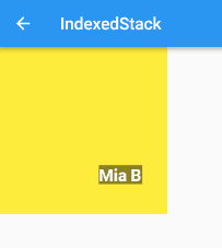
IndexedStack继承自Stack,它的作用是显示第index个child,其他child都是不可见的。所以IndexedStack的尺寸永远是跟最大的子节点尺寸一致。
2.2 例子
在此还是将Stack的例子稍加改造,将index设置为1,也就是显示含文本的Container的节点。
Container(color: Colors.yellow,child: IndexedStack(index: 1,alignment: const Alignment(0.6, 0.6),children: [CircleAvatar(backgroundImage: AssetImage('images/pic.jpg'),radius: 100.0,),Container(decoration: BoxDecoration(color: Colors.black45,),child: Text('Mia B',style: TextStyle(fontSize: 20.0,fontWeight: FontWeight.bold,color: Colors.white,),),),],),)
2.3 源码解析
其绘制代码很简单,因为继承自Stack,布局方面表现基本一致,不同之处在于其绘制的时候,只是将第Index个child进行了绘制。
@overridevoid paintStack(PaintingContext context, Offset offset) {if (firstChild == null || index == null)return;final RenderBox child = _childAtIndex();final StackParentData childParentData = child.parentData;context.paintChild(child, childParentData.offset + offset);}
2.4 使用场景
如果需要展示一堆控件中的一个,可以使用IndexedStack。有一定的使用场景,但是也有控件可以实现其功能,只不过操作起来可能会复杂一些。
3. GridView
A scrollable, 2D array of widgets.
3.1 简介
GridView在移动端上非常的常见,就是一个滚动的多列列表,实际的使用场景也非常的多。
3.2 布局行为
GridView的布局行为不复杂,本身是尽量占满空间区域,布局行为上完全继承自ScrollView。
3.3 继承关系
Object > Diagnosticable > DiagnosticableTree > Widget > StatelessWidget > ScrollView > BoxScrollView > GridView
从继承关系看,GridView是在ScrollView的基础上封装而来的,这跟移动端的类似。
3.4 示例代码
GridView.count(crossAxisCount: 2,children: List.generate(100,(index) {return Center(child: Text('Item $index',style: Theme.of(context).textTheme.headline,),);},),);
示例代码直接用了Creating a Grid List中的例子,创建了一个2列总共100个子节点的列表。
3.5 源码解析
默认构造函数如下:
GridView({Key key,Axis scrollDirection = Axis.vertical,bool reverse = false,ScrollController controller,bool primary,ScrollPhysics physics,bool shrinkWrap = false,EdgeInsetsGeometry padding,@required this.gridDelegate,bool addAutomaticKeepAlives = true,bool addRepaintBoundaries = true,double cacheExtent,List<Widget> children = const <Widget>[],})
同时也提供了如下额外的四种构造方法,方便开发者使用。
GridView.builderGridView.customGridView.countGridView.extent
3.5.1 属性解析
scrollDirection:滚动的方向,有垂直和水平两种,默认为垂直方向(Axis.vertical)。
reverse:默认是从上或者左向下或者右滚动的,这个属性控制是否反向,默认值为false,不反向滚动。
controller:控制child滚动时候的位置。
primary:是否是与父节点的PrimaryScrollController所关联的主滚动视图。
physics:滚动的视图如何响应用户的输入。
shrinkWrap:滚动方向的滚动视图内容是否应该由正在查看的内容所决定。
padding:四周的空白区域。
gridDelegate:控制GridView中子节点布局的delegate。
cacheExtent:缓存区域。
3.5.2 源码
@overrideWidget build(BuildContext context) {final List<Widget> slivers = buildSlivers(context);final AxisDirection axisDirection = getDirection(context);final ScrollController scrollController = primary? PrimaryScrollController.of(context): controller;final Scrollable scrollable = new Scrollable(axisDirection: axisDirection,controller: scrollController,physics: physics,viewportBuilder: (BuildContext context, ViewportOffset offset) {return buildViewport(context, offset, axisDirection, slivers);},);return primary && scrollController != null? new PrimaryScrollController.none(child: scrollable): scrollable;}
上面这段代码是ScrollView的build方法,GridView就是一个特殊的ScrollView。GridView本身代码没有什么,基本上都是ScrollView上的东西,主要会涉及到Scrollable、Sliver、Viewport等内容,这些内容比较多,因此源码就先略了,后面单独出一篇文章对ScrollView进行分析吧。
3.6 使用场景
使用场景很多,非常常见的控件。也有控件可以实现其功能,例如官方说的,GridView实际上是一个silvers只包含一个SilverGrid的CustomScrollView。
4. 后话
笔者建了一个Flutter学习相关的项目,Github地址,里面包含了笔者写的关于Flutter学习相关的一些文章,会定期更新,也会上传一些学习Demo,欢迎大家关注。
5. 参考
- Stack class
- IndexedStack class
- GridView class
- ScrollView class
